One of the biggest challenges for agencies is “selling” a creative idea. Sometimes, they go over well, like the time I witnessed the owner of a family-owned construction company light up at the idea of a “Sharknado”-themed ad campaign. Other times our ideas don’t go over as well, like when a client thought an ad campaign was too mean because it indirectly poked fun at their competitors.
But if an idea is backed up by data, if we could prove that out-of-the-box, edgy or humorous campaigns drive as-good or better results, perhaps we can use these examples as selling points for our clients.
Another challenge for agencies is demonstrating the “why” behind a messaging strategy. My favorite example of misaligned messaging strategy is QR codes on a billboard. While QR codes were very trendy at one time, it makes no sense to put a QR code on a billboard on the side of the Interstate when people are driving by at 65+ mph.
So, if those advertisers had seen data demonstrating where and how QR codes perform best, perhaps they would have revised their messaging strategy.
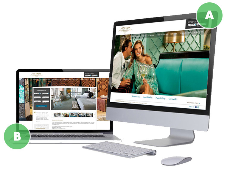
In two recent B2C digital ad campaigns, we addressed these types of questions and concerns using comparative datasets generated from simple A/B testing.
 A/B testing isn’t rocket science, but it can be very effective. In this case, to test the effectiveness of two different digital ads, we simply ran them in the same market over the same period of time targeting the same audience, and compared which creative had higher engagement rates. We looked at click-through rate and engagement rate as our primary metric, as the campaigns were trying to generate brand awareness as opposed to driving specific conversions or sales goals. But, you can take it further down the funnel and compare conversion rates if that were your goal.
Example A: National Enthusiast Brand
Recently, one of our clients (a national enthusiast brand) was promoting a new product line. The client was accustomed to running ads with copy touting benefits and features with simple product imagery. Our creative team wanted to try out something new that maintained the brand integrity, but utilized edgier copy and imagery.
Initially the client was hesitant, unsure that the new ads would drive results. So, we suggested running them in tandem with the usual ads to see how they compared. Of course our hopes were that the edgy ads would outperform the norm, but the data would be the deciding factor.
So, we ran the ads in equal rotation, on the same network, with the same geographic and demographic targets for 90 days. What we found was that the two ads, though very different, both drove a relatively similar click-through rate over the course of the campaign.
Though we didn’t see vastly different results from either ad, we can at least now make the case that updating the old style with some new copy and imagery will drive results just as well. This opens the door for more creative ideas and tests in the future and will help us make a case when the team wants to try another new, out-of-the-box idea.
Example B: A Local Construction Client
We recently introduced a client to the world of programmatic digital buying. They knew they were behind the times in that regard and trusted us to help them get up to speed, with the ultimate goal of increasing awareness and driving more traffic to their site.
But, when it came to the digital creative, the client wanted to use a phone number with a “call today” call-to action. They believed that people in the market for their services were more likely to pick up the phone and call to learn more information. Our argument was that when users are online they are much more likely to click an ad and go to someone’s website to learn more, because they’re already in that mode of operation. It seemed counterintuitive that someone would stop, write down a phone number, and call later.
In this case, click-through rate wasn’t the best metric to measure, because if people truly were going to call they weren’t going to click on the ad either way. But, we could measure the performance of the creative on engagement rate (which includes both clicks and mouse hovers over the ad) to demonstrate which ad was more likely to catch the user’s eye.
So for three months we ran the ads with the phone number at the client’s request. The engagement rate was roughly 1.03%. After the three months, we received approval on a new creative that included more engaging imagery and a “learn more” call to action button that dropped users on the client’s homepage. We saw instant results—in the first 30 days (again, running on the same network with the same targeting factors) the interaction rate soared up to 1.75%. This demonstrated that the new creative clearly outperformed the first and was more engaging to the user.
In both examples, the A/B test helped us use data to support our creative and strategy recommendations and decisions for our clients. It is also a very educational tool; if you or the client are truly unsure about which type of strategy and messaging will work best, you can use an A/B test to generate data and discover the answer.


