
OUR WORK
Social Media & PR
Michelin
IMSA PR
DISCOVER MORE

Digital & Video
Sports Afield
Website
DISCOVER MORE

Branding
Hawk Performance
Rebranding
DISCOVER MORE

Experiential
Ineos
GRENADIER EXPERIENTIAL TOUR
DISCOVER MORE
Race Support & Product Sales
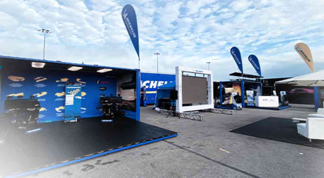
Michelin
Consumer Activation
DISCOVER MORE
Consulting & Strategy
Trijicon
TV Spots
DISCOVER MORE

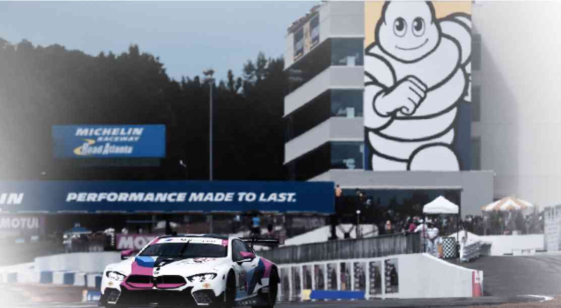
Social Media & PR
Road Atlanta
STORYTELLING ON SOCIAL MEDIA
DISCOVER MORE
Consulting & Strategy
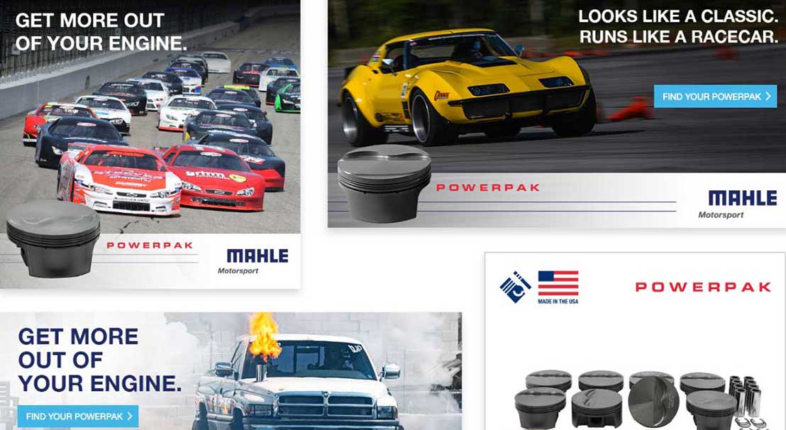
Mahle
BRAND VALUE CASE STUDY
DISCOVER MORE
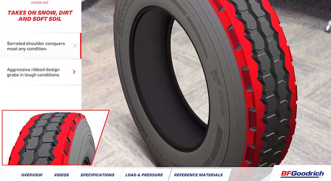
Digital & Video
BFGOODRICH TIRES
Augmented Reality
DISCOVER MORE
Consulting & Strategy
Trijicon
24 Days of ACOG Online Contest
DISCOVER MORE
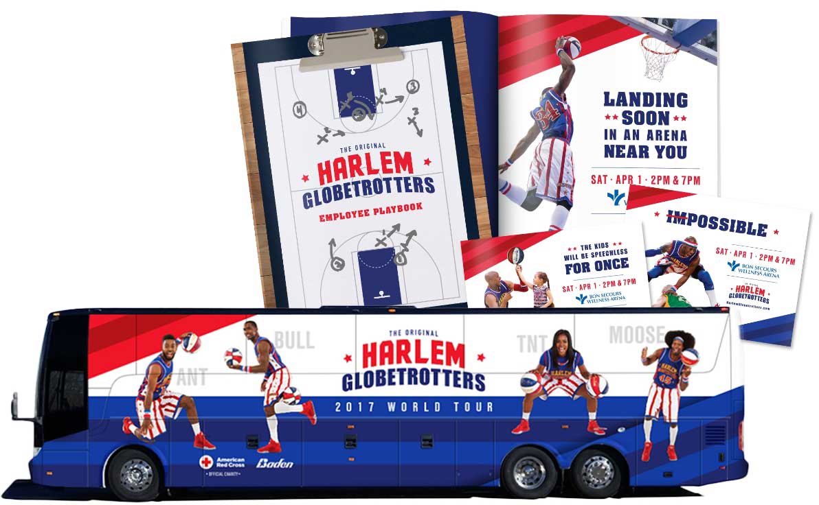
Branding
Harlem Globetrotters
Branding
DISCOVER MORE
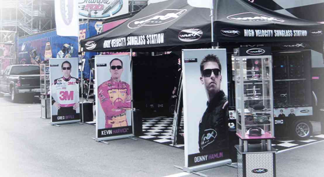
Experiential
Wiley X
Product Sales Tour
DISCOVER MORE

Experiential
Michelin
Product Training
DISCOVER MORE
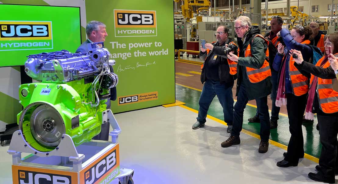
Social Media & PR
JCB
Hydrogen PR
DISCOVER MORE

Experiential
BFGoodrich Tires
Product Launch
DISCOVER MORE
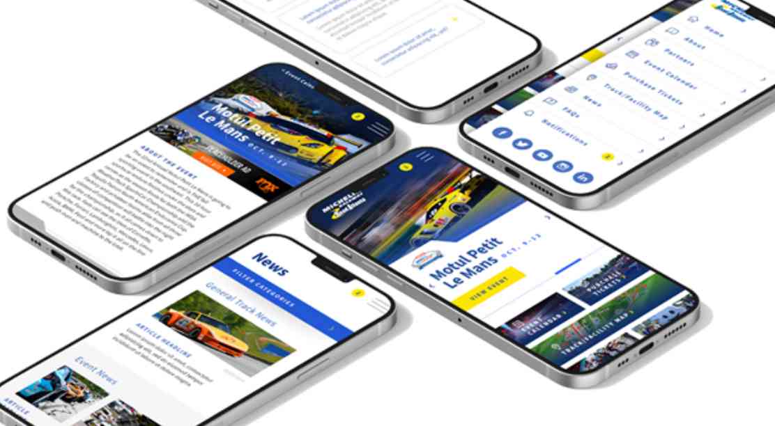
Digital & Video
Michelin
RACEWAY ROAD ATLANTA PP
DISCOVER MORE
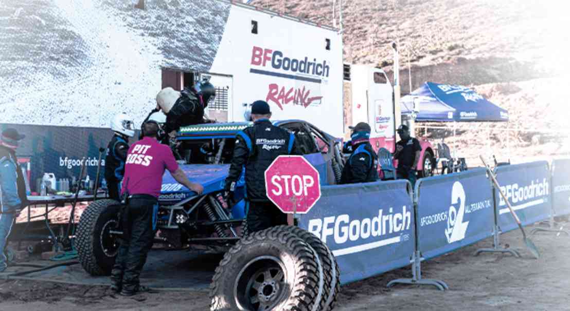
Experiential
BFGOODRICH TIRES
MOTORSPORTS EVENT LOGISTICS
DISCOVER MORE
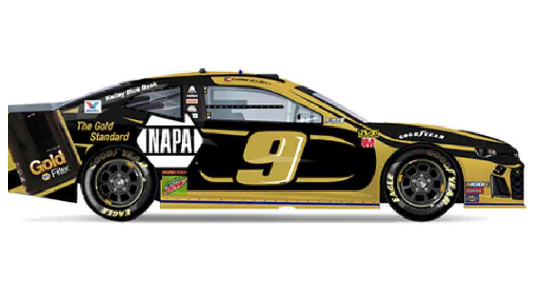
Branding
Chase Elliot's
Nascar Ride Gets a Facelift
DISCOVER MORE
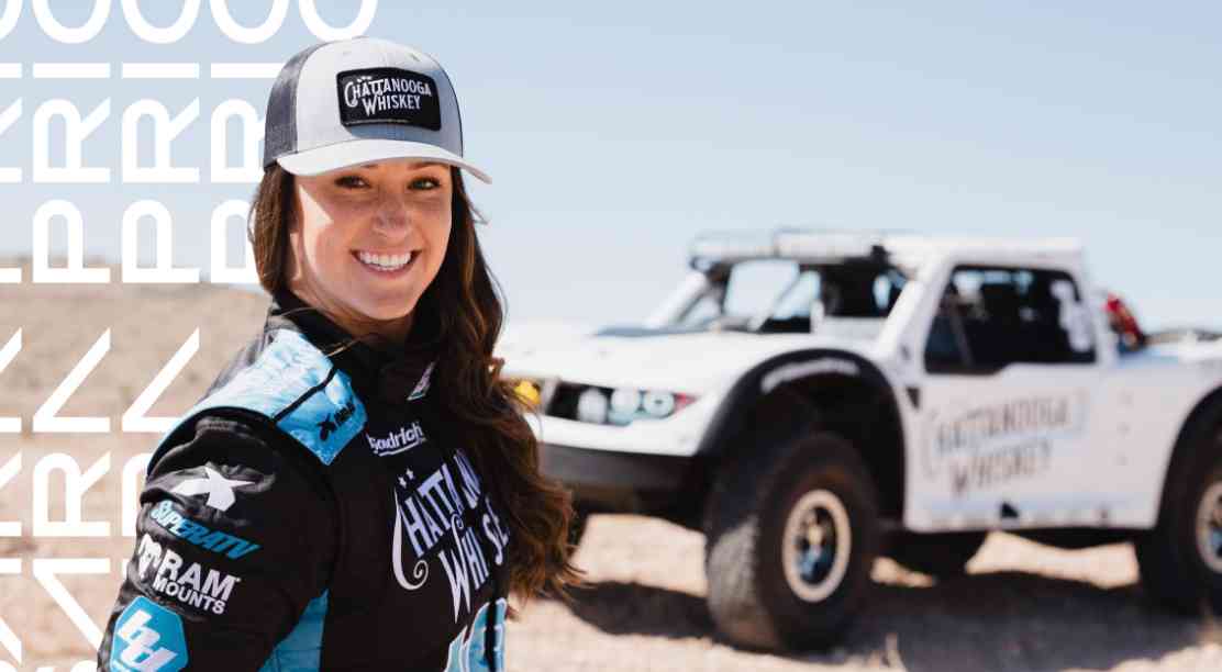
Branding
Motorsports
Sarah Price Rebranding
DISCOVER MORE
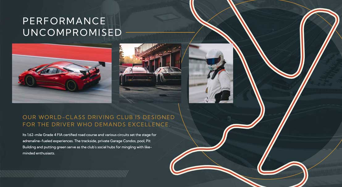
Digital & Video
Charleston Motorsports Club
Website
DISCOVER MORE

Branding
Big League World Series
Marketing Campaign
DISCOVER MORE
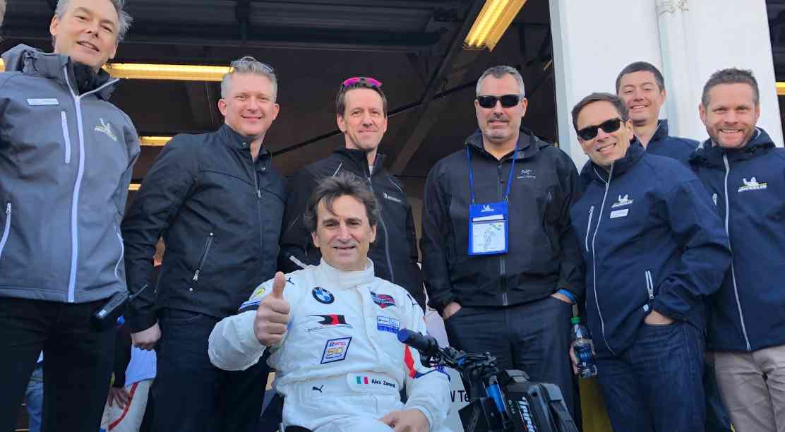
Experiential
Michelin
THE OFFICIAL TIRE OF IMSA
DISCOVER MORE
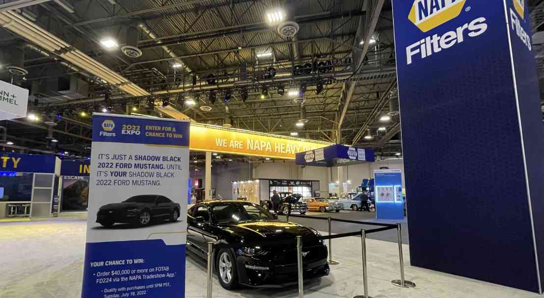
Experiential
Napa Filters
THE NAPA AUTO PARTS EXPO
DISCOVER MORE
OFFICES
HQ
864.272.3000
WEST COAST
619.493.0858


